Users expect deals in the last months of the year, so you should work on Black Friday 2021 campaigns. This is the most anticipated weekend, as sales are really good and people take advantage of it to buy whatever they want.
Black Friday kicks off the holiday shopping season, so there are significant sales in both retail stores and department stores. It is a great opportunity for companies to get rid of old stock such as collections from past seasons.
That’s why Black Friday 2021 campaigns cannot miss in your marketing calendar with which you can reach all consumers who have been waiting all year for this famous weekend of crazy discounts.
Black Friday campaigns to inspire you
It is always good to have examples to follow that will help you create your Black Friday 2021 campaigns. For this reason, you will see some newsletters designed by recognized brands for this discount season so demanded by customers:
1.- Apple
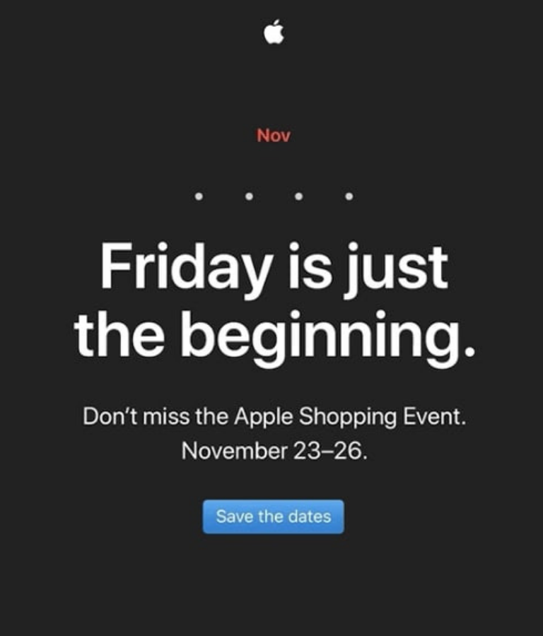
Less is more, this is exactly what the design of Apple’s newsletter communicates, which begins with its traditional logo. Although they do not put the word “Black” in the headline, the black background is emblematic and is complemented by the phrase “Friday is just the beginning.”
Underneath the catchy headline, there is a short paragraph urging “don’t miss Apple’s shopping event” and then pointing out the days when it will take place. And, of course, you can’t miss the call to action, which requires the user to make a reservation for this occasion.
Apple has always stood out for its minimalist design, with its usual colors being black and white. This shows that the company always adheres to the brand identity. What stands out most is that it has put aside the use of images of its products and focused on simplicity and clarity of text to convey the message.
2.- Forever 21
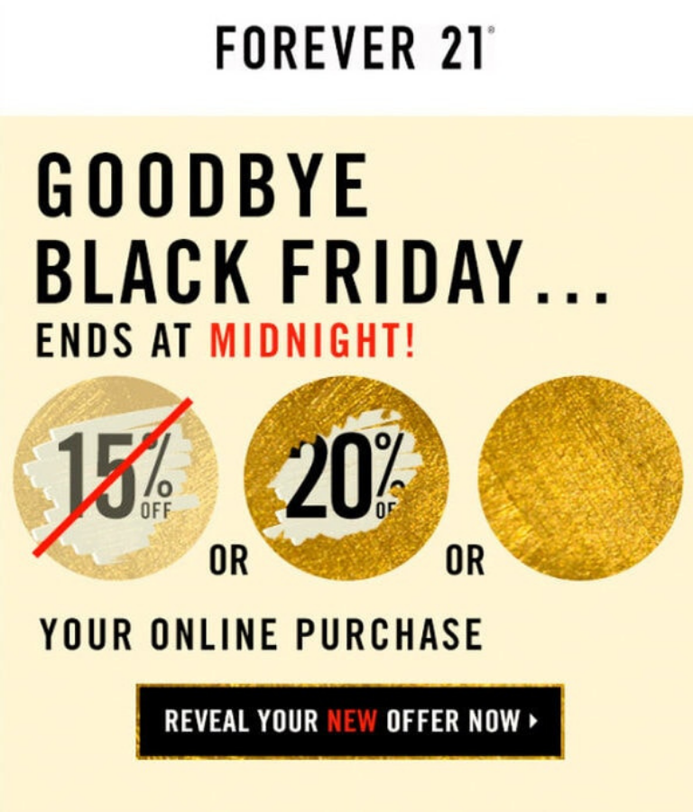
On this list of Black Friday 2021 campaigns that can inspire you for this year is Forever 21. This creative design begins with a headline that awakens a sense of urgency, “Goodbye Black Friday… it ends at midnight!”
Next comes the most striking thing, the presentation of the discounts as if they were a lottery ticket of the kind you scratch to see what’s underneath. This digital version of the card succeeded in attracting and piquing the interest of consumers. They also used animated GIFs to liven up the newsletter.
After the discount percentages, there is text indicating the discount that will be applied to the online purchase. And then a call-to-action inviting the subscriber to unveil their new offer. It has everything necessary for users to feel interested in finding out what discount they will get.
It should be noted that this is just one of the series of emails Forever 21 sent out for the Black Friday campaign. But they all maintained the same digital paper dynamic and design aesthetic. Although they all focus on the same thing, they wanted to convey it in a different way.
3.- Casper
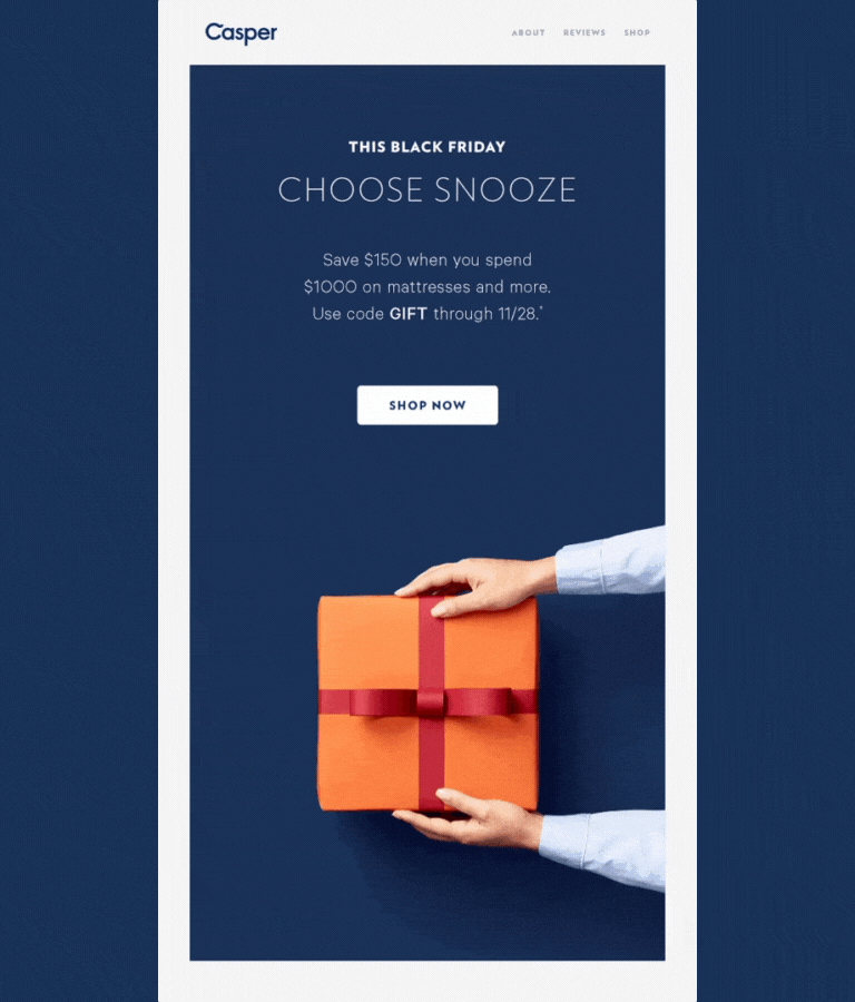
It is normal for Black Friday campaigns to use colors such as black and red, but that does not mean that it cannot be done differently. An example is that of the Casper brand, which relies on a blue and white tone. But it makes it clear to subscribers that this is a Black Friday version.
Casper does not specify the percentage off, but the amount a customer can save on a purchase. It also offers consumers a gift code and they get straight to the point with an inviting CTA.
But beyond the information it provides to the subscriber, what is most striking is the GIF. It is a gift box and when opened it shows a moon, a graphic that makes sense given that it is a mattress store. This makes a clear reference to sleeping at night.
4.- National Geographic
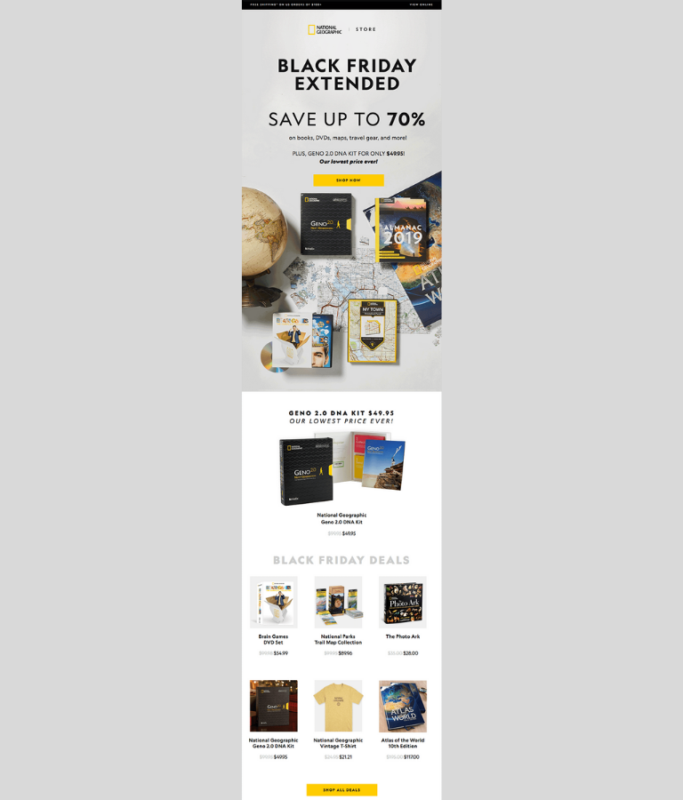
Another of the Black Friday 2021 campaigns that can inspire you is that of National Geographic. It also retains its brand identity by using its signature colors, which in this case are yellow, gray, and black.
From the outset, it makes it clear how much customers can save by purchasing books, DVDs, maps, travel supplies, and more. It also offers one of its kits at a fairly low price, followed by the CTA so consumers can buy.
They also show a selection of their products on sale at their normal price versus the discounted price. All of this ends with another call to action that reads “Buy all offers,” is a way of reaffirming the first CTA.
5.- The Hill-Side
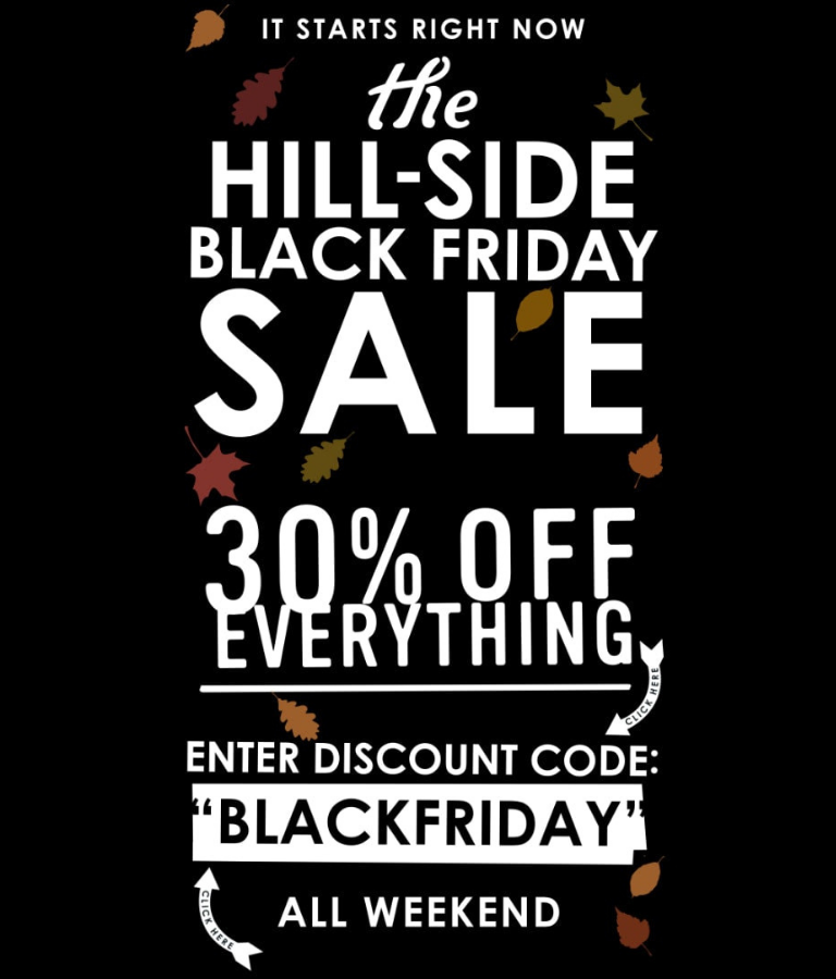
Black is back in the design, in this case by The Hill-Side brand, but it has a splash of color with fallen leaves scattered all over the canvas. Undoubtedly, what stands out most in the text is the word “Sale,” along with the phrase “30% off everything.”
In addition, they offer a special Black Friday discount code that will be valid for that weekend. Without a doubt, this newsletter contains everything the user needs to know. And they use large fonts that, although they may be challenging, achieve the goal of capturing attention.
6.- BaubleBar
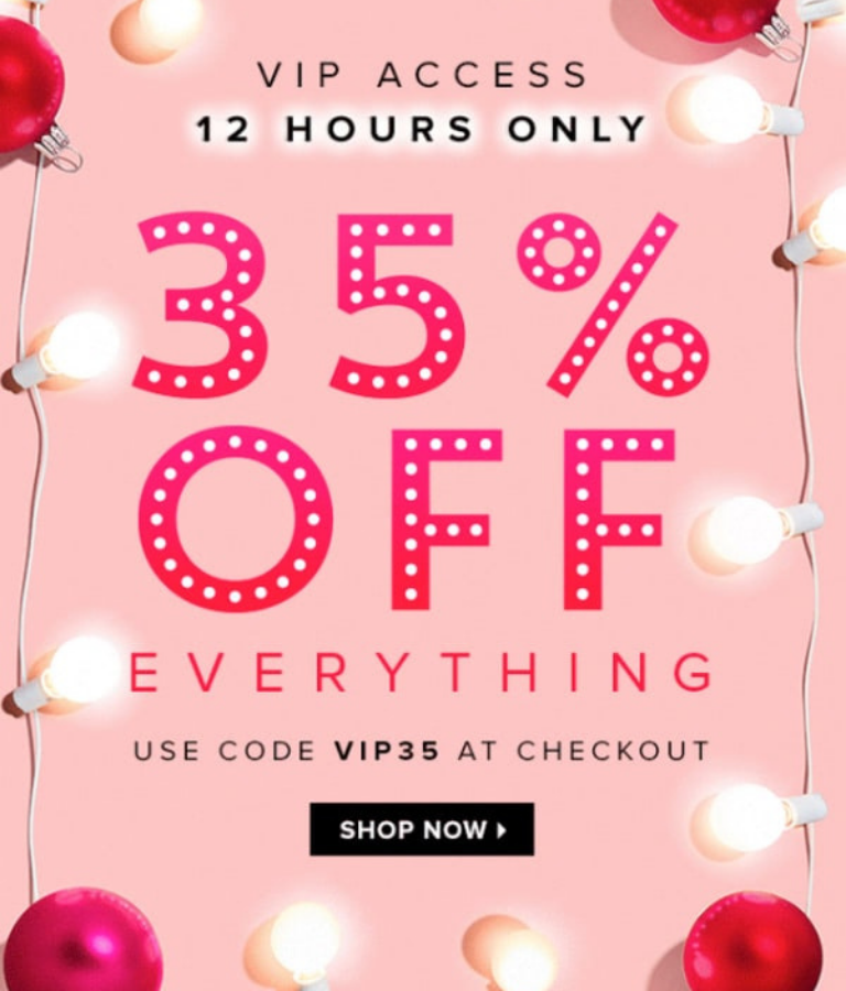
For Black Friday 2021 campaigns you can use BaubleBar as a guide, which also preserves brand identity. Start with a keyword “VIP Access.” If there is one thing consumers love, it is feeling unique.
It is a brand that stands out for its use of the color pink, which is present throughout the design and makes it instantly recognized by customers. Aside from the exclusive access, it emphasizes the sense of urgency by stating that it is “only 12 hours.” In addition, the discount percentage takes up most of the screen, with no need to saturate.
And last but not least, they also provide a VIP discount code, followed by the call to action. Both the exclusivity and the limitation of this offer encourage the user to make the purchase as soon as possible.